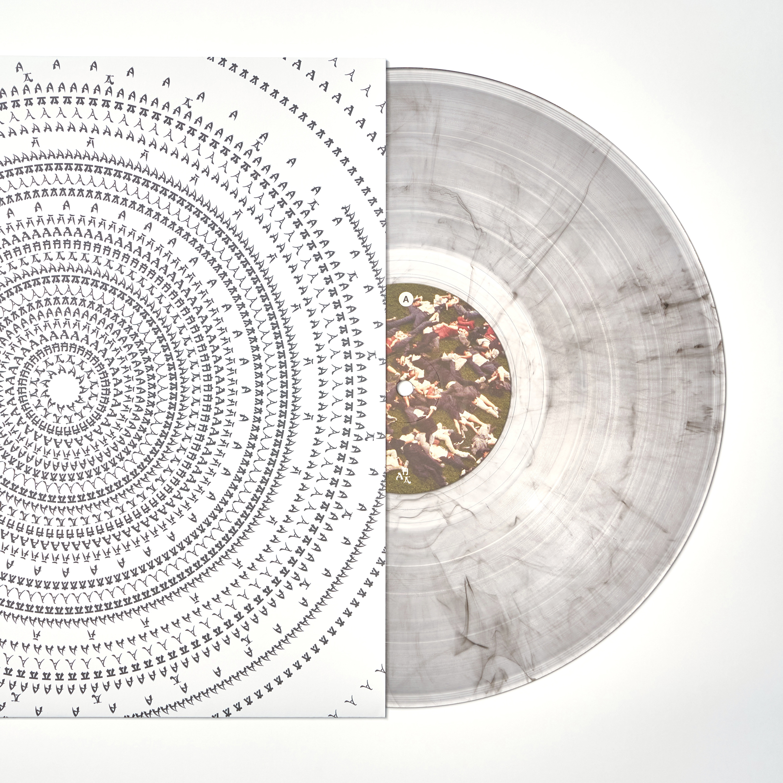
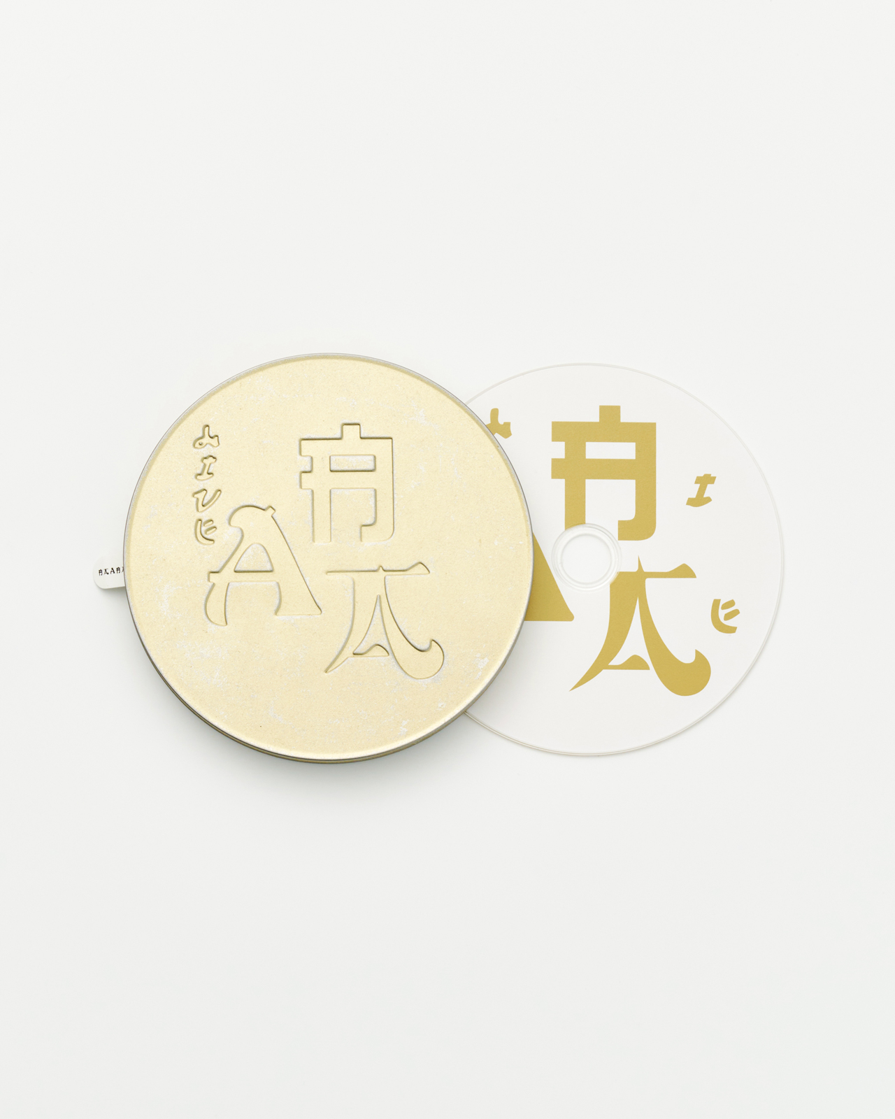
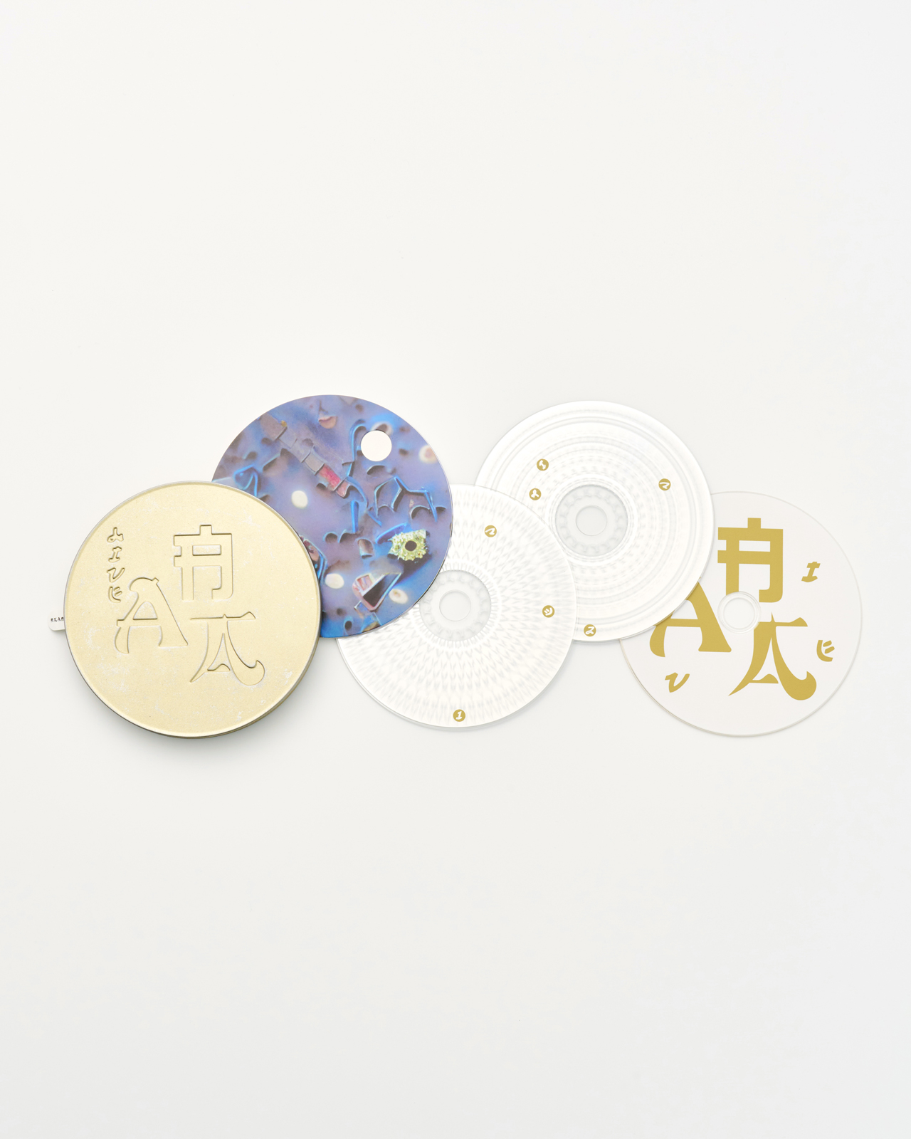

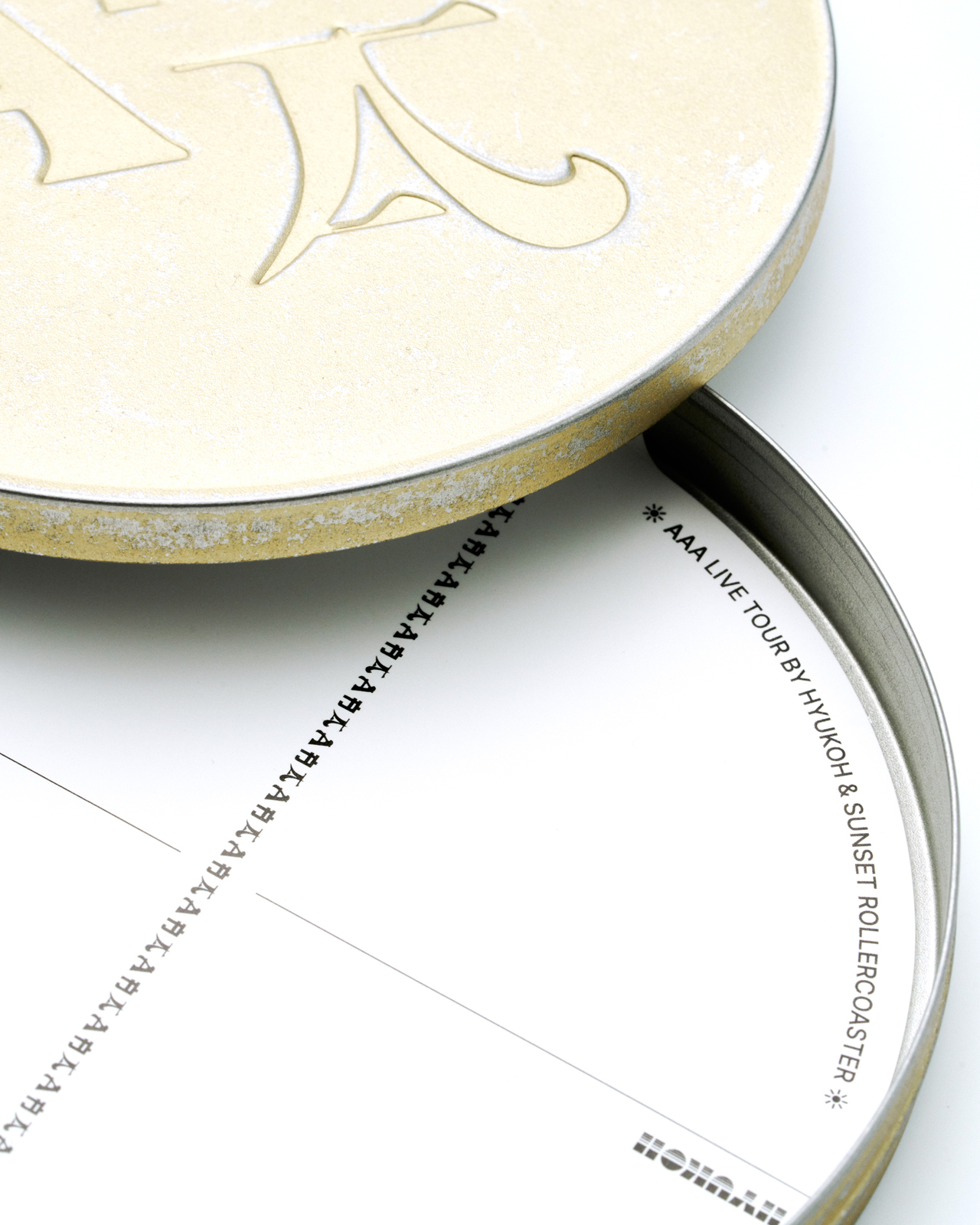
AAA, Project album by HYUKOH and Sunset Rollercoaster, 2024
Commision: DOOROODOOROO Artist Company
Collaborator: Chanhee Hong (Image generation with AI)
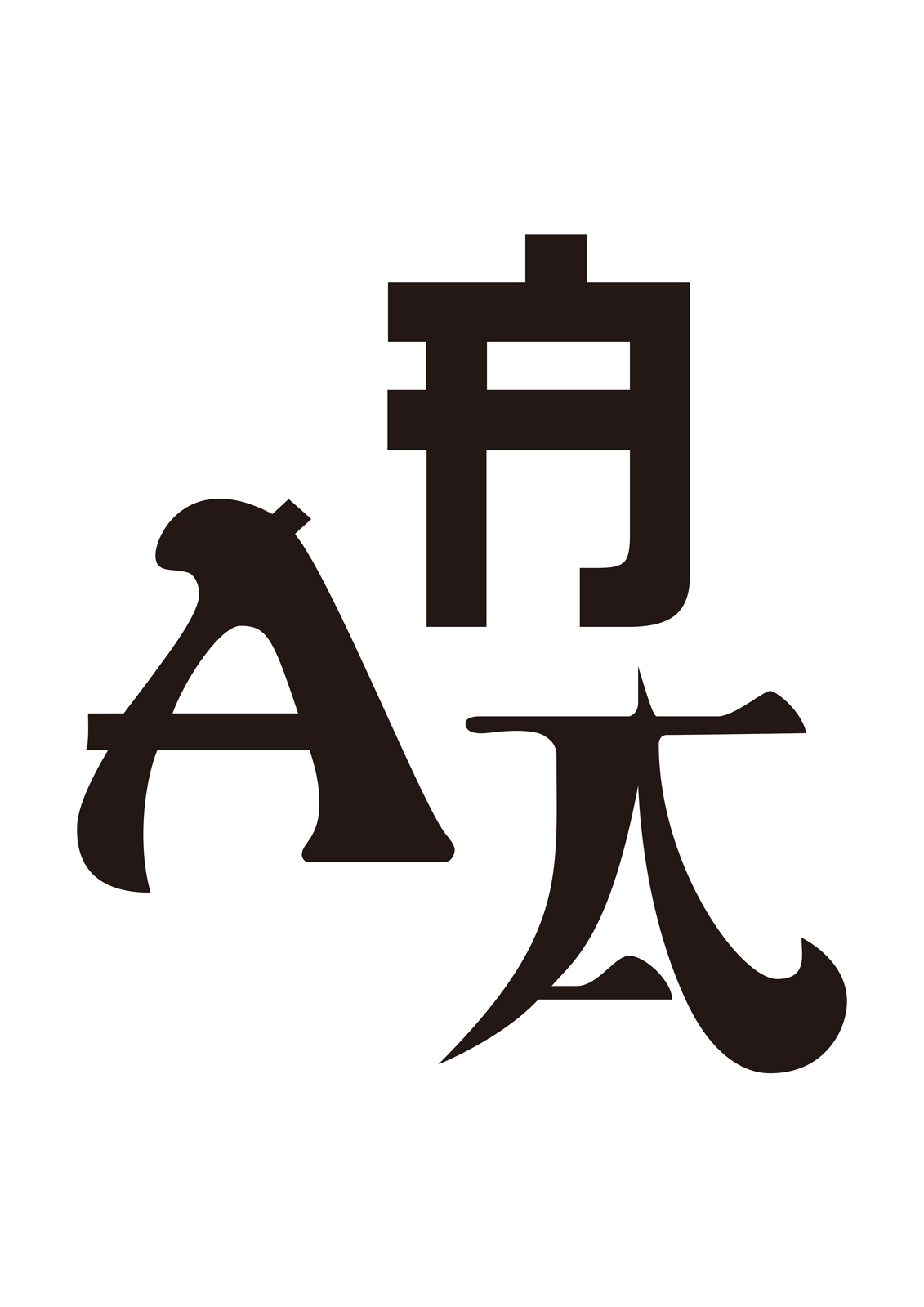
When I was commissioned to design this AAA album, I spoke with Oh Hyuk about Asian identity in our time, and the first image that came to mind was a Chinese restaurant sign I had seen years ago in the Netherlands. Almost every place serving something resembling Asian food used a typeface known as 'Mandarin', or some variation of it. When I first encountered it, I couldn't make sense of the phenomenon. The alphabet had been shaped, a little awkwardly, with strokes of unknown origin, and something about it made me uncomfortable every time I looked. A few years later I realized this wasn't only a Dutch habit but a convention across Europe and, in fact, nearly everywhere outside East Asia. At some point the formula 'Asian food equals Mandarin' had simply become familiar. I remember ordering fried rice or wonton soup, anything better than a dried-out sandwich, muttering "but why??" every single time.
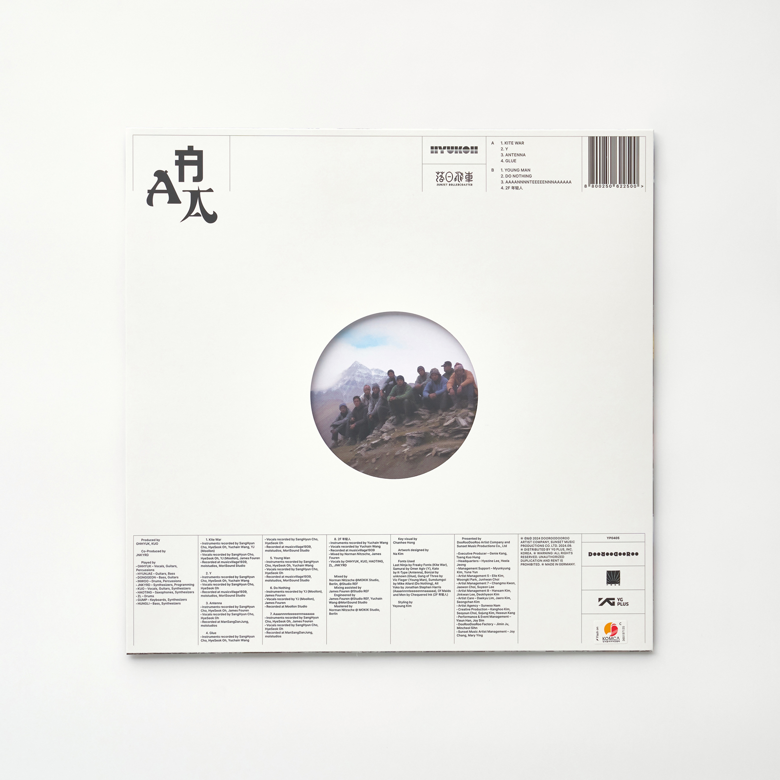
'Mandarin' is based on a typeface originally called, of all things, 'Chinese', released in 1883 by the Cleveland Type Foundry. These days, beyond Mandarin, many other typefaces share this same aesthetic. What's worth noting is that the people who use these fonts are mostly Asians making a living far from home, for whom this visual sign has become familiar enough to need no further question, while those who design the fonts are, for the most part, not Asian. These typefaces differ in style and background from the Chinese of 150 years ago, but one thing curiously stays the same: they are 'Asian style' typefaces that 'Asians' would never make. Their naming is striking too. Last Ninja, Samurai, Gang of Three, Of Maids and Men, Kato, Bonzai, All Yoko, Sumdumgoi, and so on. Skim through them and a strange discomfort sets in. Sumdumgoi, apparently, is 'Some Dumb Guy' spelled in Cantonese pronunciation.
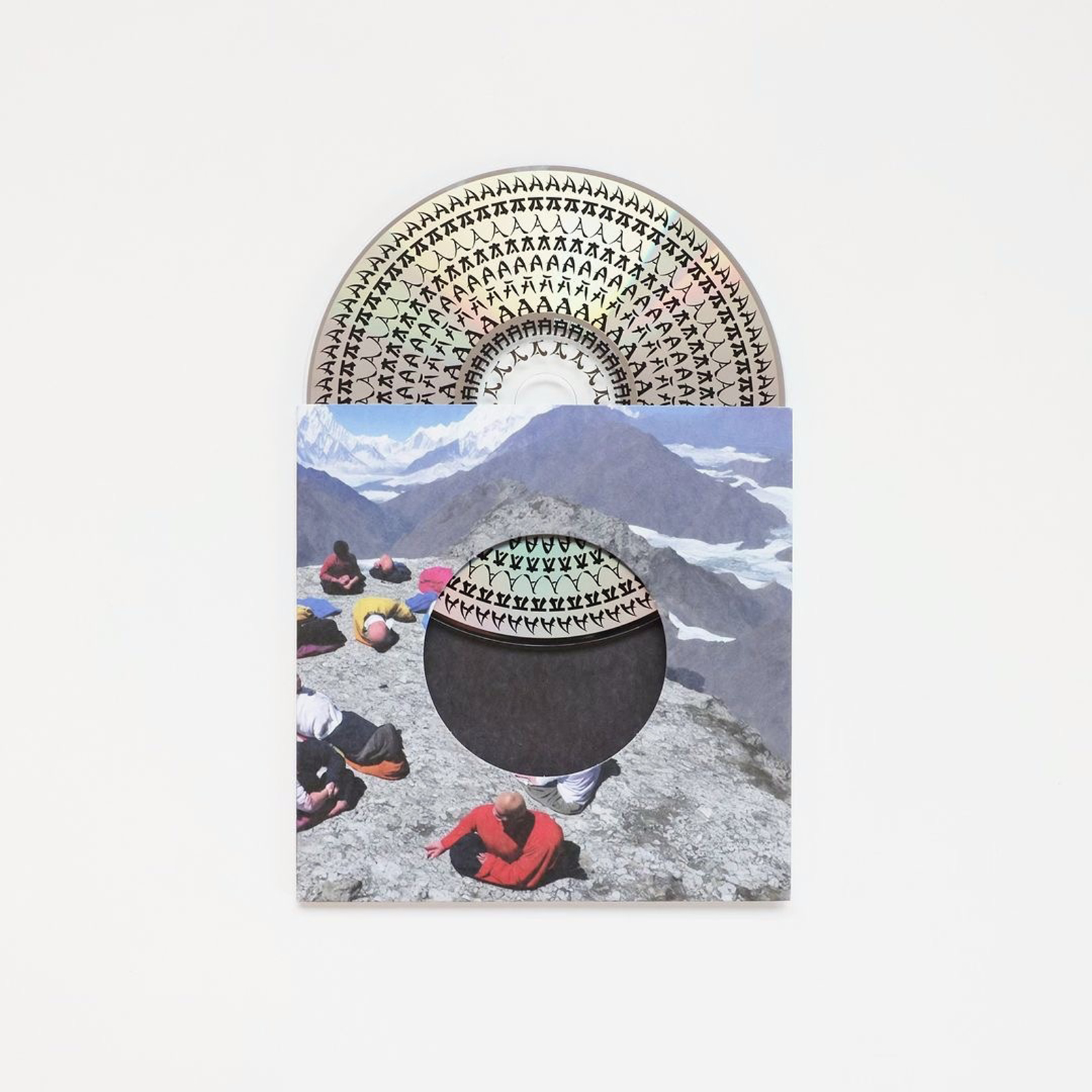
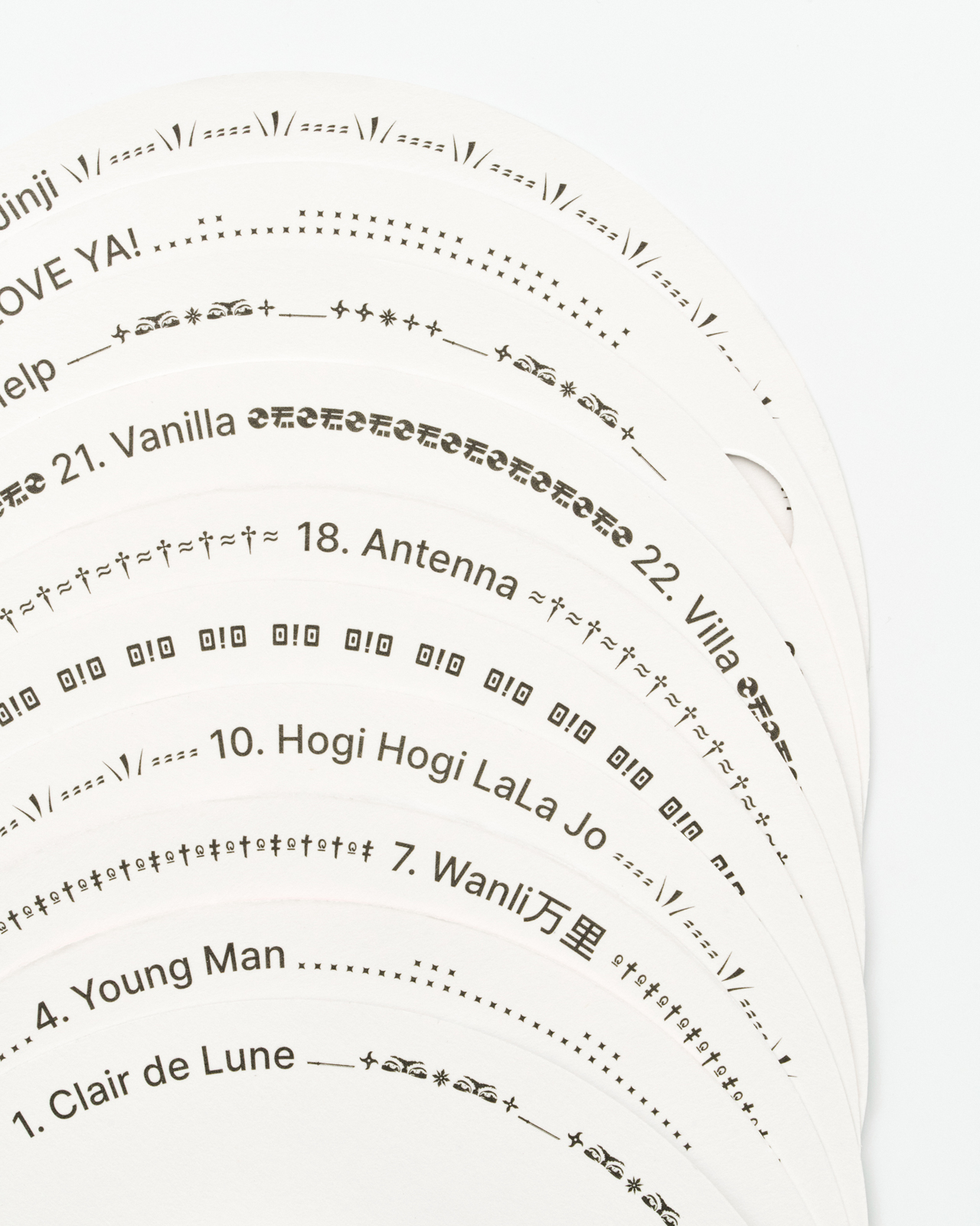
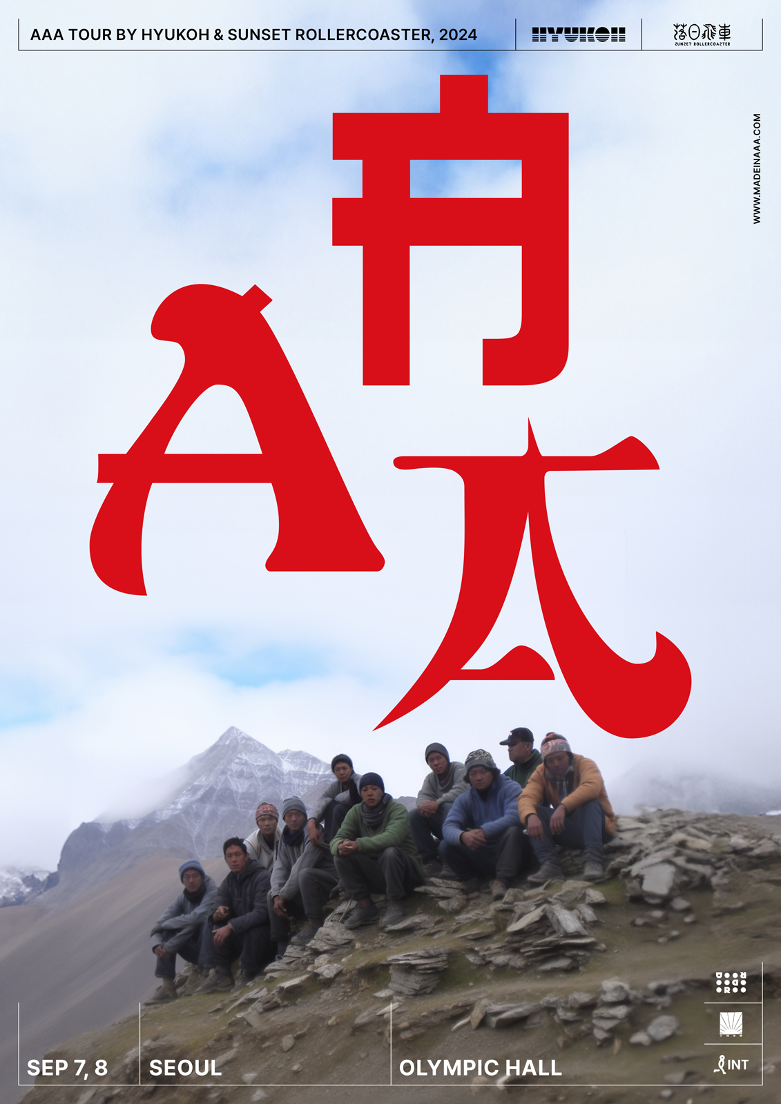
This AAA album design was built by combining the letter A from several typefaces chosen against this backdrop. The titles of the songs on the album were set in these same fonts. Before the design was released, some within the team were concerned about this background, but if you think about it, that very concern is perhaps the point this design wants to raise.
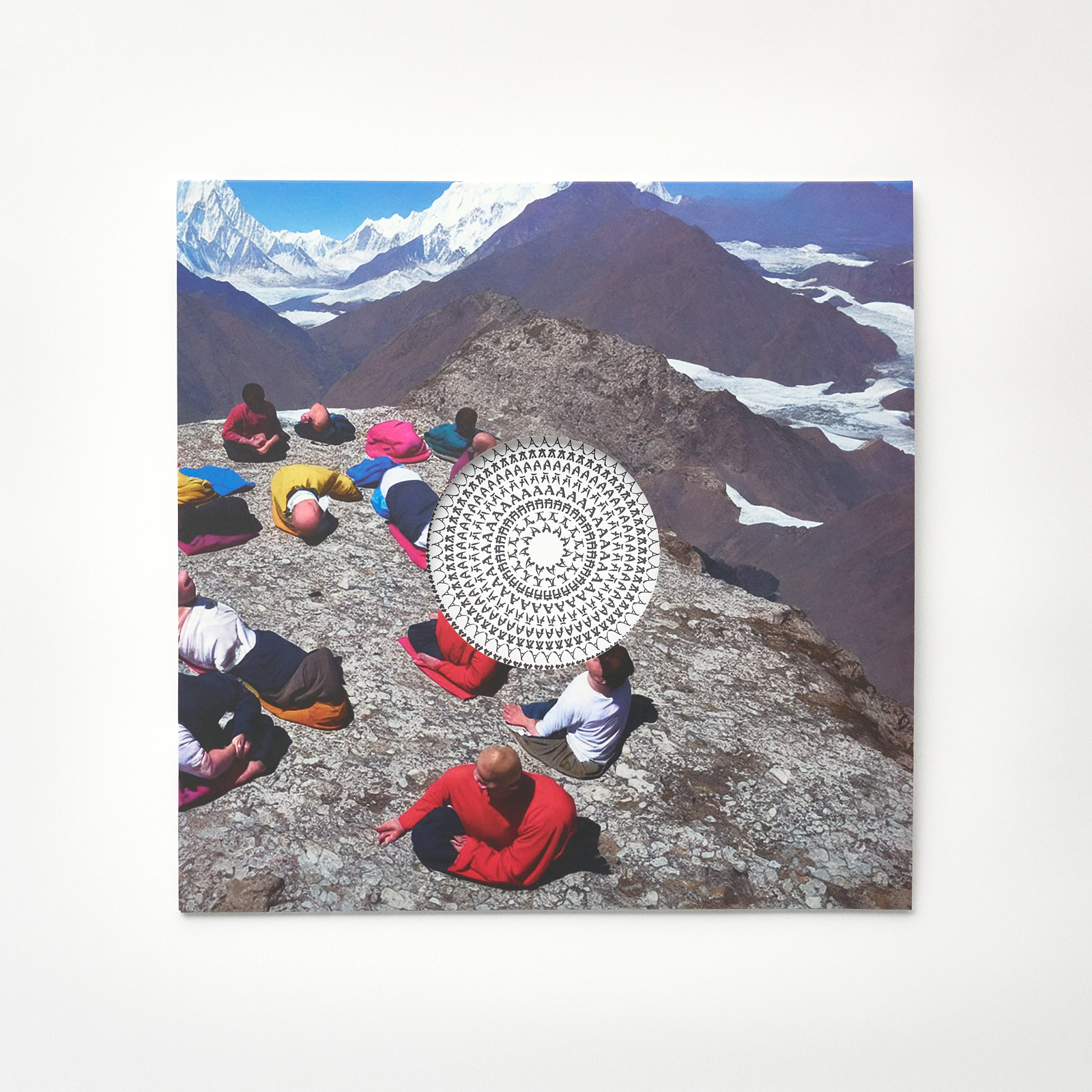
The images used alongside the design were made by Hong Chanhee of Balming Tiger, using generative AI. Built from prompts evoking Asia, they place the members of the two bands, with a certain nonchalance, against backgrounds that don't actually exist yet still call a specific region to mind.
(Excerpted from Interview)